How To Make Squarespace Look Great on Every Screen
Have you ever spent hours designing your site on desktop, only to check it on your phone and discover that it does not look like what you expected?! 😳 Don’t worry, Squarespacer, this happens to everyone, including me when I launched my first Squarespace website! Mobile view is its own design challenge, but with the right tips, you can make your site look amazing on any screen.
In this video, I’ll show you how to edit and adjust the mobile version of your website. From hiding certain blocks in the editor to aligning content with the right settings, and even adding custom CSS for tricky sections, you’ll learn about all the tricks I use to make Squarespace websites look great on smaller screens.
EDITOR FEATURES FOR CUSTOM LAYOUTS
-
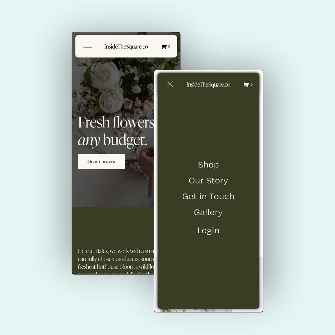
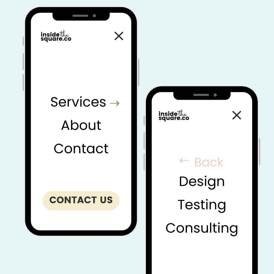
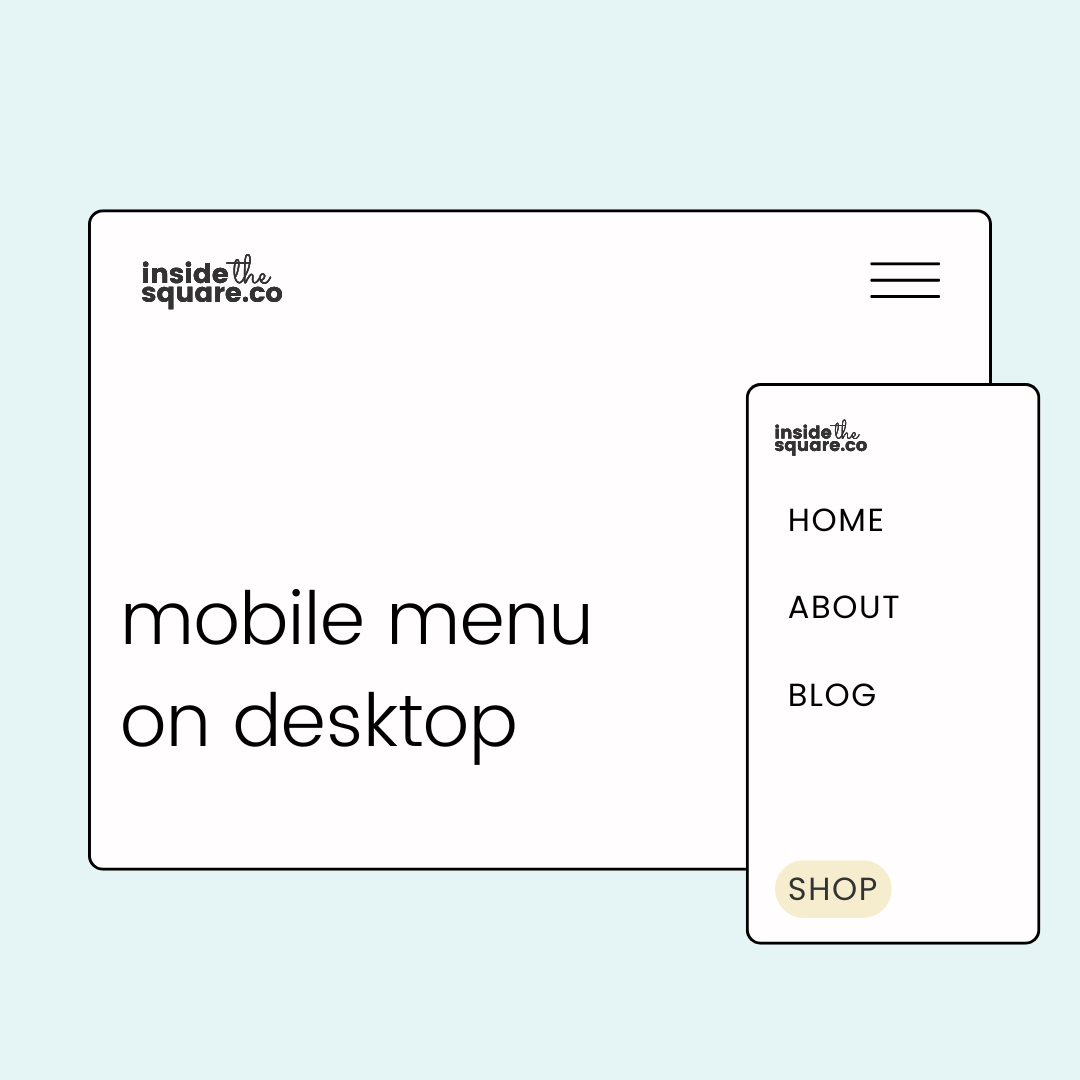
Hide Content Blocks
Use the Layers Panel to hide certain buttons or images on desktop vs. mobile. For example, a “Click to Call” button is perfect on mobile but unnecessary on desktop.
-
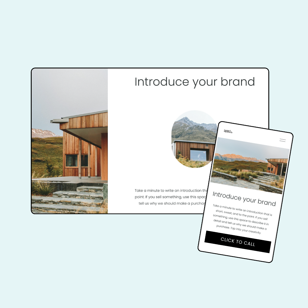
Toggle Off "Fill Screen"
Adjust this option in the Section settings to let images and blocks align fully to the screen edges, making layouts more polished.
-
Adjust Vertical Alignment
Don’t let text or accordion content sink to the bottom of a section. Change the vertical alignment to keep things easy to read on small screens.
A few more pointers before you get started…
Squarespace is a responsive website builder. This means it will automatically change the look, size, and layout of your website content based on screen size. Using the media queries below, you can overwrite some of these responsive changes, but be careful that you aren’t reinventing the wheel! Some of their responsive style changes are there to help with accessibility standards and to make it easier for people to navigate the content of your site. Just because you can change it doesn’t mean you should. 😉
Devices are always changing. The current size iPhone is a totally different screen size and resolution than it was 5 years ago, and 5 years from now, it’s probably going to be different again! This is why responsive site builders like Squarespace are great - your site will change based on breakpoints so you don’t have to keep track of every single phone width out there. That also means that trying to make your website look pixel perfect on a specific screen isn’t always the best idea.
Customization Tips Using Code
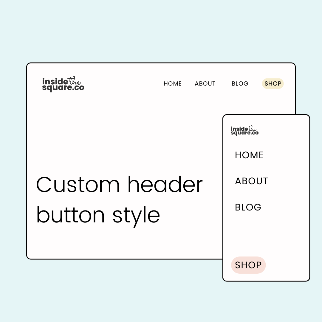
Use media queries: With
@media screen (max-width:640px)you can set styles just for mobile, like hiding or resizing sections.Hide/show sections: Name your sections (like “desktop” and “mobile”), then use CSS to display one version on desktop and another on mobile.
Only use custom CSS if you really need it. Overriding Squarespace’s responsive setup should be a last resort if built-in options don’t get you the look you want. I like to use it for making modifications to auto layouts like collections and list sections.
Suggested breakpoints for Squarespace 7.1
These are the codes I use in my own Squarespace site creations and are just a suggestion. Change up any of the PX values below to create your own breakpoint.
// mobile only
@media only screen and (max-width: 640px) {
code goes here
}
// tablet only
@media only screen and (min-width: 641px) and (max-width:950px) {
code goes here
}
// desktop only
@media only screen and (min-width: 951px) {
code goes here
}
Where to Find More Info
Squarespace makes updates all the time, so staying in the loop matters. Here are a few resources worth bookmarking.
-
Squarespace Forum
Check out the “What’s New at Squarespace” section of the Forum for monthly updates
-
Squarespace Circle Blog
Learn new design techniques, get insights form experts, and read about recent updates in our Squarespace community.
-
Refresh Recap
Read my annual Refresh Recap article, where I break down Squarespace’s biggest annual updates.
Check out some of the latest mobile-specific tutorial videos below!