How to Make a Floating Mobile Navigation in Squarespace
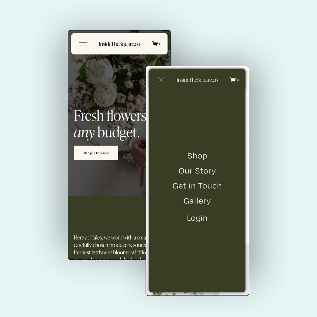
Want to give your mobile site that extra bit of polish? This CSS trick creates a floating mobile header and a floating mobile menu that lifts off the page with shadows and subtle spacing. It’s a clean and modern look that works beautifully on all Squarespace 7.1 sites.
In the video tutorial below, you’ll learn exactly how to add this effect using custom CSS. I’ll walk you through how to target mobile screens, float the header, adjust spacing, and apply a fixed position so your nav stays visible on scroll. And of course, you can grab the exact code you need right here in this post, directly underneath the video.
Below are the exact snippets I used in the tutorial, along with a quick explanation of what each one does. You can copy and paste these into your site wide Custom CSS & be sure to update the margins and border radius to match your own unique site style.
Pro tip: in the video, I was able to reach my site wide CSS from my pages menu by clicking on custom code at the bottom of the pages menu, and then selecting custom CSS. If that option isn’t available for you, press the / key on your keyboard to open the program search and look for CSS so you can navigate their directly.
💻 The Code You’ll Use
Here’s a quick breakdown of the CSS properties used to style the floating mobile header and menu. These values are totally customizable, so feel free to adjust them to match your site’s style.
Pro tip: this code is inside a code block so it’s not fully visible on the page; click the copy code button to copy it directly from the blog and paste it into your own site.
The first part of this code is wrapped in a media query that targets screens 767px wide or smaller. That means these styles will only apply on mobile devices. If you want the effect on tablets too, just increase that number (like 950px).
margin: 15px;
Creates space between the header or menu and the edge of the screen so it appears lifted off the background.
border-radius: 12px;
Softens the corners for a rounded, modern design—change this to 0px for square corners.
box-shadow: 0 0 10px rgba(0, 0, 0, 0.2);
Adds depth by creating a subtle shadow; increase the last value for a darker effect or lighten it for a softer one.
overflow: hidden;
Keeps everything neatly inside the edges—no need to adjust this one; it’s best left as is.
/* floating mobile header from insidethesquare.co */
@media only screen and (max-width: 767px){
  .header{
    margin:15px;
    border-radius: 12px;
    overflow: hidden;
    box-shadow: 0 0 10px rgba(0, 0, 0, 0.2);
    position:fixed!important;
    z-index:9999!important;
  }
  #page {
    position: relative;
    z-index: 1;
  }
}
/* floating mobile menu from insidethesquare.co */
.header-menu {
  margin: 15px;
  border-radius: 12px;
  overflow: hidden;
  box-shadow: 0 0 10px rgba(0, 0, 0, 0.8);
}