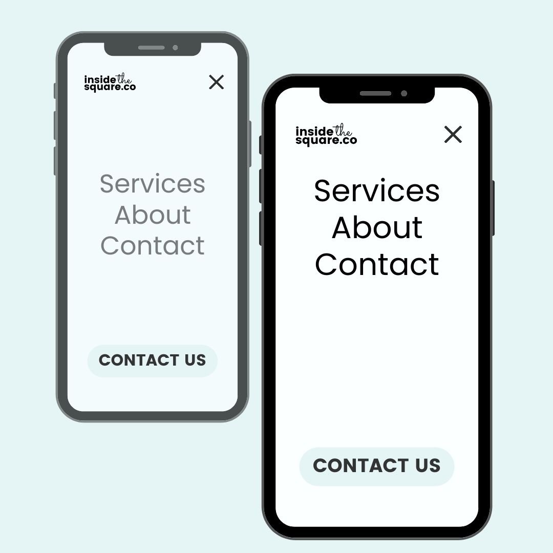
How to move your mobile menu links to the top
In Squarespace 7.1 you can use the layout options to change the horizontal alignment of your mobile menu links - left, right, or center - but those links will always be centered vertically, by default. This code below will move those links up to the top of the device.
/* insidethesquare.co - mobile links at the top */
.header--menu-open .header-menu-nav-folder-content{
 justify-content:flex-start!important
}
Want to add a little distance between the header and the links? We can use the same code, and add a little margin to the top! Give this a try and adjust 3vh to a value that suits your style. Pro tip: vh stands for view height, so this code will scoot the mobile menu down by 3% of the screen height. You can replace 3vh with 30px or any other value you want to use.
/* insidethesquare.co - mobile links at the top */
.header--menu-open .header-menu-nav-folder-content{
 justify-content:flex-start!important;
 marign-top: 3vh!important
}
How to add this code to Squarespace
The preferred method is to add code to your CSS panel. You’ll find it by navigating to pages under your website menu, then selecting website tools, then custom css.
Be advised that the location and labels inside the Squarespace menu can change. To quickly locate your CSS panel, you can press the / button on your keyboard to open up the program search feature. This search feature is for Squarespace program menus, and will not search the content of your site. Look for Custom CSS and you’ll be taken directly to the CSS panel.
To apply custom code to an individual page on your website, check out this resource article for more info: tutorials.squarespace.com/resources/install-code
Important update: Squarespace made changes to the program menu in May 2025. If your menu looks different than the video, press the / key to open the program search and search for Custom CSS to navigate there directly.