How to create a full screen menu on all devices
In this tutorial, you’ll learn how to display the mobile menu on all devices—including desktops—with just a little bit of custom code. Plus, I’ll show you some cool customization tricks to make the menu look amazing on any screen size.
Let’s dive in!
Important update: Squarespace made changes to the program menu in May 2025. If your menu looks different than the video, press the / key to open the program search and search for Custom CSS to navigate there directly.
Enable the Mobile Menu to All Devices
To start, we’ll use custom code to enable the mobile menu on all devices. Here’s how:
Navigate to Pages > Website Tools > Custom CSS in Squarespace.
Paste the following code into the CSS panel:
/* code from insidethesquare.co */
/* mobile menu code from insidethesquare.co */
.header .header-burger{
display:flex
}
.header-nav, .header-actions {
display:none
}
.header--menu-open .header-menu {
opacity: 1;
visibility:visible;
}
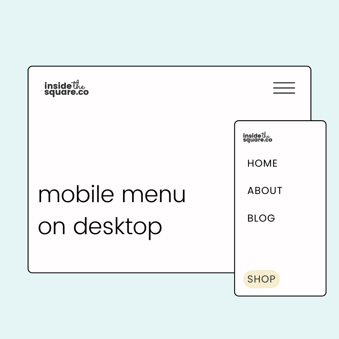
After adding the code, you’ll notice the mobile menu icon appears on the desktop version of your site. When clicked, the menu expands into a full-screen view, just like it does on smaller devices.
Adjust the Menu Size for Larger Screens
While the full-screen menu is perfect for smaller screens, it can feel overwhelming on larger ones. Let’s fix that by modifying the menu size for screens wider than 767 pixels. This code ensures that the menu only takes up half the screen on larger devices, creating a cleaner and more professional look. This code also includes a drop shadow to make the mobile menu visibly separate from the screen.
/* half screen desktop menu from insidethesquare.co */
@media only screen and (min-width:767px){
.header--menu-open .header-menu {
width:50%;
box-shadow:5px 5px 15px #333;
margin-left:50%
}
}
Pro Tip: For those of you with your mobile menu icon on the left hand side of the screen, remove the part of the code above that says margin-left: 50%
Related Content
Want to explore more ways to customize your Squarespace website? Check out these related tutorials: