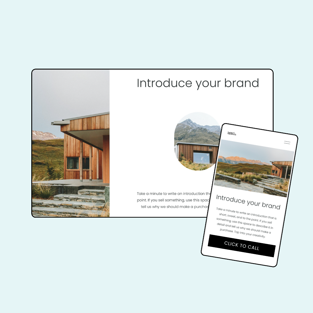
How to hide one content block on mobile or desktop
Sometimes you need your Squarespace site to show different things on different devices. Maybe that beautiful desktop layout is a bit too much for mobile, or perhaps you want to add a special mobile-only button. In this tutorial, you’ll learn how to use a media query to control exactly what shows up on mobile versus desktop.
Important update: Squarespace made changes to the program menu in May 2025. If your menu looks different than the video, press the / key to open the program search and search for Custom CSS to navigate there directly.
Here is a link to the Will’s Block ID Chrome Extension:
Here are the codes from this tutorial; update the block-id to your own:
/* hide on mobile - insidethesquare.co code */
@media only screen and (max-width: 767px){
#block-1234 {
display: none
}
/* hide on desktop - insidethesquare.co code */
@media only screen and (min-width: 767px){
#block-1234 {
display: none
}
/* hide on mobile and tablet - insidethesquare.co code */
@media only screen and (max-width: 950px){
#block-1234 {
display: none
}
/* hide on desktop and tablet - insidethesquare.co code */
@media only screen and (min-width: 950px){
#block-1234 {
display: none
}

