How To Add A Background Image to Your Squarespace Mobile Menu
Want to give your Squarespace mobile menu a fresh new look? In this quick tutorial, I’ll show you how to add a custom background image that appears only when your mobile menu is open. It’s a simple change with a big visual impact—and you don’t need to be a CSS pro to make it happen.
Watch the video below to follow along step-by-step, then scroll down to grab the code and customize it for your own site.
Step by step process:
First, Upload your background image
Use the fowardslash key to search for your CSS options.
Click on Custom CSS to navigate to your CSS pannel.
Click the dropdown arrow next to "Manage Custom Files" and select the + icon to upload your image.
Then, open your mobile menu preview
This helps you see changes in real-time while you add the code.
Paste the CSS code below
Use the code provided below and place your cursor between the parentheses after
url().
Click on your uploaded image from the custom files list to automatically insert the correct URL.
Customize the CSS properties
background-image:This tells the mobile overlay to display an image as its background. You’ll add your image file URL here.background-size: cover;This makes sure the background image fills the entire mobile menu space, no matter what size the screen is. It crops as needed to avoid stretching.background-position: center;This centers the image both vertically and horizontally. You can change it totop left,top right,bottom center, etc., if you want more control.
/* mobile menu background image code from insidethesquare.co */
.header-menu-bg {
  background-image: url(your-image-url-here)!important;
  background-size: cover!important;
  background-position: center!important;
}
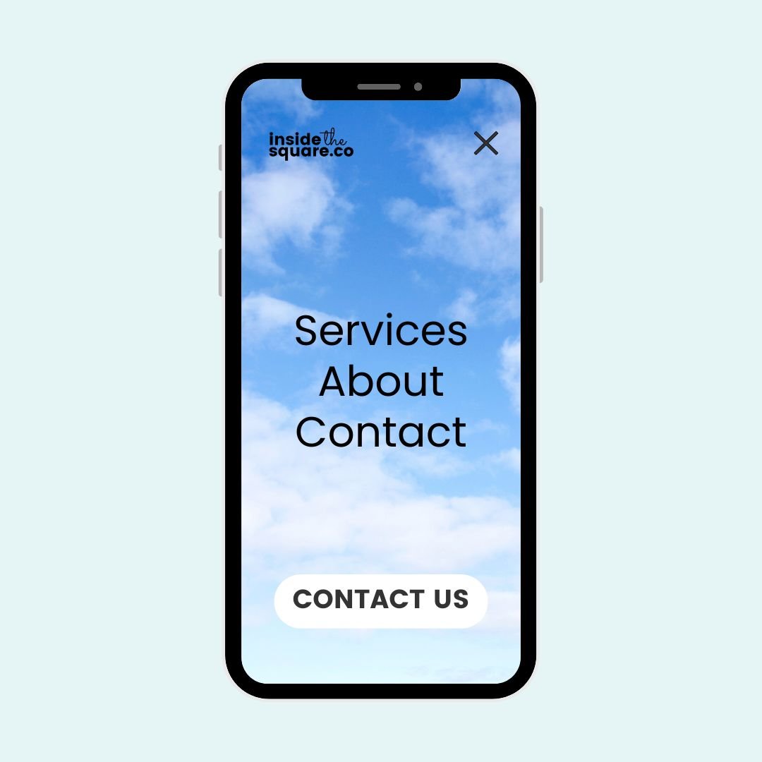
Recommended Image Ratio
To make your design look great on most mobile screens, I recommend using an image with a 9:16 aspect ratio—that’s the standard portrait orientation of mobile phones. Even better? Choose an image that’s at least 1200px tall, so it looks crisp on high-resolution screens.
If your image is too small, it might look blurry or get stretched. And if it’s too wide, important parts of the image might be cut off. Keeping the design simple and vertically aligned is your best bet.