
How to create two columns of content for the mobile version of Squarespace
This tutorial is specifically for the latest version of Squarespace, known as 7.1, and won't work for older versions of Squarespace. For more information, visit https://insidethesquare.co/themes
One of the more common code requests I get is how to create two columns on mobile, for products, videos, lists and more.
So, that’s exactly what we are covering in this video–force Squarespace to leave two columns of content on smaller screens!
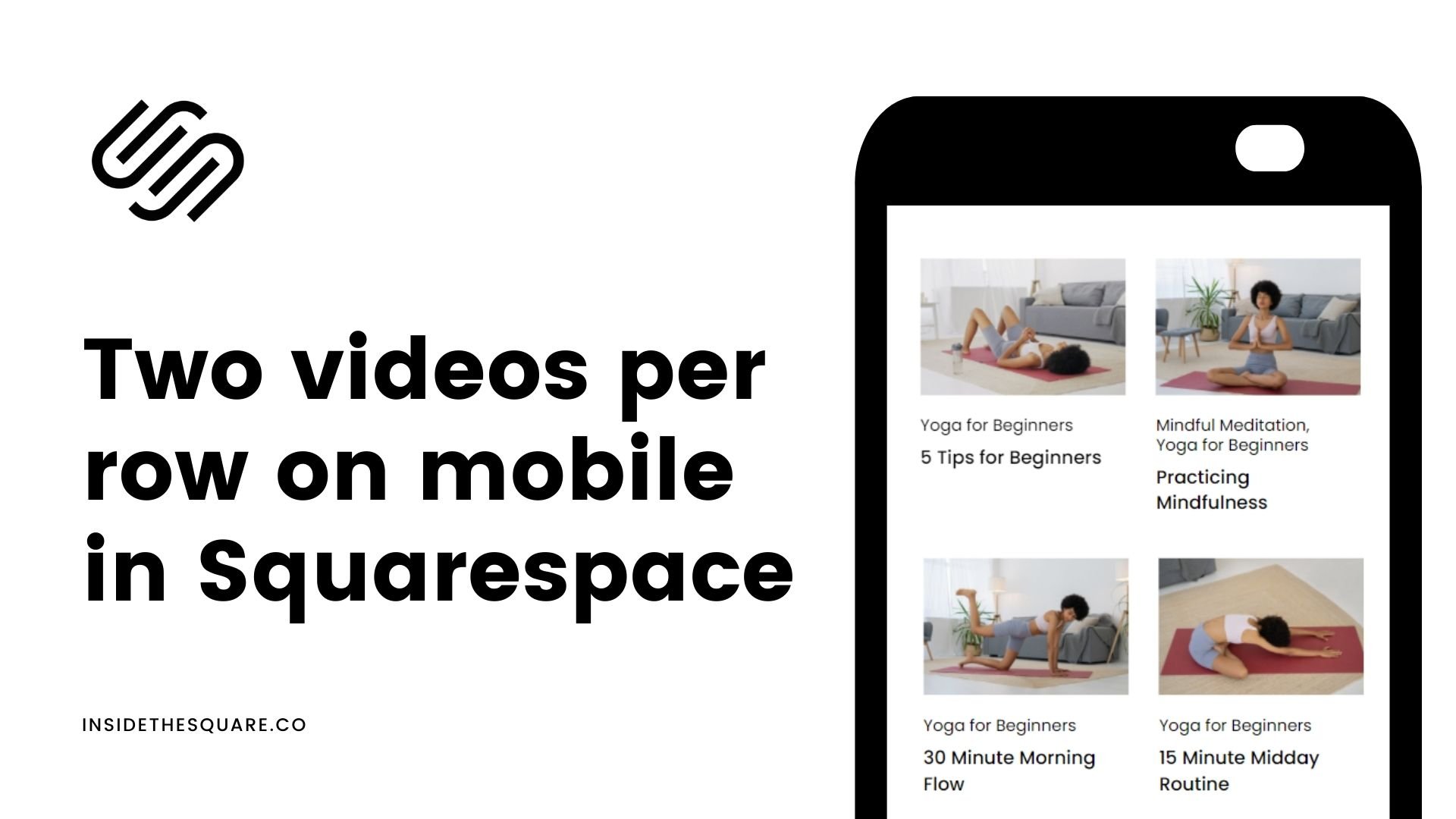
Video Collection Pages: Two Videos per Row on Mobile
This tutorial covers video collection pages, a new feature to Squarespace in 2022.
For some reason this code is a little funky when you add it to custom CSS, so be sure to look at the mobile version of your site and not just the site preview!
Here is the code from this tutorial:
@media only screen and (max-width:788px) {
.lessons .list-grid {
display:grid;
grid-template-columns: repeat(2, minmax(0, 1fr))!important
}
}
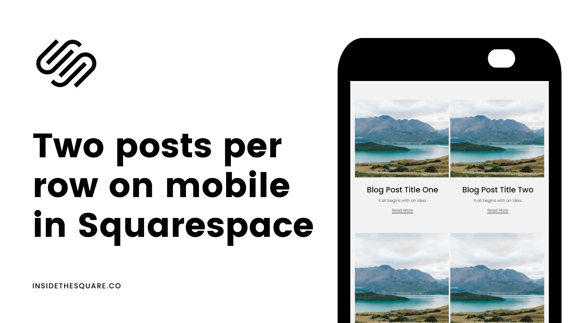
Grid Blog Layout: Two Posts per Row on Mobile
This tutorial covers the grid blog layout for Squarespace, the one I use here on InsideTheSquare.co!
Here is the code from this tutorial:
@media only screen and (max-width:767px){.blog-basic-grid {
display: grid;
grid-template-columns: repeat(2,minmax(0,1fr))!important;
grid-column-gap: 5px!important;
grid-row-gap: 5px!important;
grid-auto-rows: min-content!important;
}}
Products: Two Columns of Products on Mobile for your Squarespace Store
This same two-per-row concept can be applied to stores too!
@media only screen and (max-width:767px) {
.products .list-grid {
display: flex;
flex-wrap: wrap;
justify-content: space-between;
}
.products .grid-item {
width: 48%;
}
}
List Sections: Two Items Per Row for Squarespace List Sections
List sections can also be displayed with two items per row specifically for the simple list section, not carousel or banner.
Here is the code from this tutorial:
@media only screen and (max-width: 640px){
.user-items-list-simple:not([data-num-columns="1"]) {
grid-template-columns: repeat(2,1fr);
grid-gap: 10px!important}
.list-item-content__title{font-size: 1rem!important}
.list-item{padding: .5rem!important}
}