How to customize your summary block styles with code
Summary blocks are one of the most versatile tools in Squarespace, but let's be honest – they can look a bit... basic. If you've ever wished your blog posts, events, products, or videos could stand out more when displayed in collections, you're in the right place!
While Squarespace's built-in design options are somewhat limited for summary blocks, a few lines of CSS can completely transform how they look and function. In this tutorial, I'm sharing five of my favorite custom summary block designs that will make your content pop. 🍿
You’ll find a step-by-step tutorial video below, and under that are all the codes you can copy, paste & customize.
Important update: Squarespace made changes to the program menu in May 2025. If your menu looks different than the video, press the / key to open the program search and search for Custom CSS to navigate there directly.
What You Can Already Customize Without Code
Before we dive into CSS magic, let's quickly cover what you can already customize in the Squarespace editor:
Layout type: Wall, Carousel, List, or Grid
Number of items displayed
Text alignment options
Read More link (for blog posts only)
Background color for the entire block
Border/stroke around the block
Font colors through the Site Styles menu
For everything else, we'll need some custom CSS! Let's start creating.
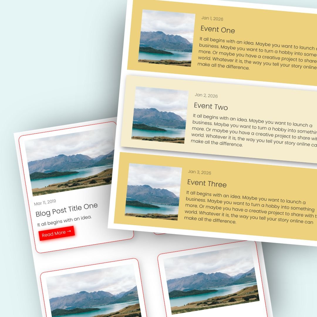
Design #1: Polaroid Blog Posts with Custom "Read More" Button
This design transforms your blog summary block into something that resembles Polaroid photos with a styled button that includes a hover effect.
Pro Tips:
Change the background color to match your site's color scheme
Adjust the padding to create the perfect frame around your content
Customize the button width (40% in this example) to fit your design
Experiment with different hover colors and shadow effects
.summary-item{
  background:orange;
  padding:1rem;
  padding-bottom:.5rem!important
}
.summary-read-more-link {
  background:white!important;
  padding: 5px;
  width:40%;
  text-align:center!important
}
.summary-read-more-link:hover {
  background:yellow!important;
 box-shadow: 2px 2px 10px
}
Design #2: Move Carousel Arrows to Bottom
For carousel layouts, the default arrow position in the top-right corner isn't always obvious to users. This code repositions them to the bottom center of your carousel, making navigation more intuitive.
Pro Tip: The only value I recommend changing here is the margin-left percentage. Adjust it to position your arrows exactly where you want them horizontally, and double check your mobile site, too!
.summary-item-list-container {
  position: relative;
  padding-bottom: 3rem;
}

.summary-carousel-pager {
  position: absolute;
  bottom: 1em;
  left: 0;
  width: 100%;
}
.sqs-gallery-controls {
margin-left: 45%;
}
Design #3: Colorful Background & Hover Effect
This design adds a colored background to your event summary items and creates a lovely hover effect that makes each event pop when users interact with it.
.summary-item{
  background:#a1d9dd;
  padding:2rem;
}
.summary-item:hover{
  background:lightpink;
  box-shadow: 5px 5px 15px grey
}
Design #4: Summary Grid with Hover Content Reveal
This is one of my absolute favorites! For summary blocks in grid layout, this code hides the product information until users hover over the image – creating a clean look with a wonderful interactive experience.
Pro Tips:
The
opacity: 0.3value controls how transparent the text overlay is. Adjust this between 0.1 (very transparent) to 0.9 (almost solid).This effect only works on devices with hover capability, which is why we've wrapped it in a media query for screens wider than 950px.
@media only screen and (max-width: 950px){
.summary-content{
  margin-top:-100%;
  position:absolute;
  opacity:0;
  width:90%;
  left: 5%
}
.summary-item:hover .summary-content{
  opacity:1!important
}
.summary-item:hover img{
  opacity:.3
}
}
Design #5: Summary Wall with Custom Metadata Placement
For video collections, this design moves the metadata (like date/duration) to appear as an overlay in the top-left corner of each video thumbnail, giving your video collection a more professional look.
Customization Options:
Change the position of the metadata by adjusting the
topandleftvaluesModify the border color to match your site's color palette
Adjust the border-radius for more or less rounded corners
Add
font-weight: boldto make the metadata text stand out more
.summary-metadata{
  position:absolute;
  top:5px;
  left:5px;
  background:#FFF;
  border-radius:20px;
  padding:5px 10px;
  box-shadow: 2px 2px 5px grey
}
.summary-item{
  border:5px solid #a1d9dd;
  border-radius:15px
}
#block-7741297c776cdd4312f1 img{
  border-radius:10px 10px 0px 0px
}
.summary-content{
padding: 5px
}
How to Implement These Designs
Go to your Squarespace admin
Navigate to Design → Custom CSS
Copy and paste the code for your desired effect
If necessary, replace the block ID with your own (for Design #3)
Save your changes and preview your site
Remember, if you want to use multiple designs on different summary blocks, you'll need to use block IDs to target each one specifically.
Finding Your Block ID
To target a specific summary block with your CSS, you'll need its unique block ID. I use a free Chrome extension called "Squarespace ID Finder" to quickly locate these IDs.
Once installed, simply click the extension icon while editing your site, and it will display the IDs for all content blocks on your page. Copy the ID for your summary block and paste it into your CSS in place of my example ID.
You’ll find the free chrome extension here: insidethesquare.co/chromeext