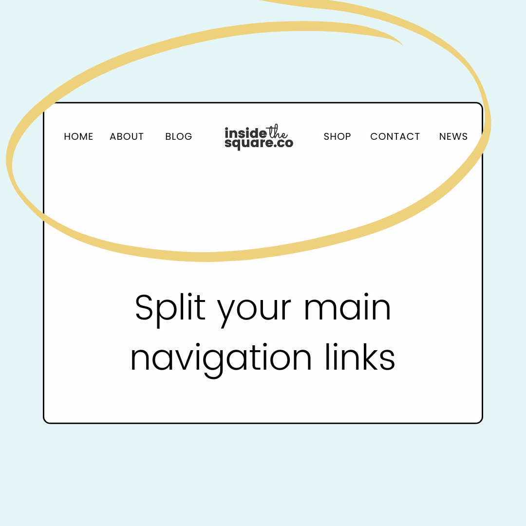
How to create split navigation in Squarespace 7.1
In this tutorial, you’ll learn how to use CSS to create a split navigation so that half of your website links are on the left of your website title or logo, and the other half are on the right.
To be clear, we’re making some layout changes here, and it wont be perfect! here are a few pro tips before you dig into the code:
You’ll need to remove all of the elements: icons, cart, button, etc
An even number of links is recommended
You will need to remove the code to adjust your site title/logo
You need to set your layout to the last design option that will center your logo. The links in your navigation will go under the logo, and we will move them with CSS. In edit mode, select edit site header, then select edit design, and choose the layout with the logo in the center and the links below it (last option)
You’ll also need to be careful about the size of your menu. This code is written for my logo and my menu link font sizes, but you might need to adjust the 1030px for your own design needs. I’ll show you how to do this in the video
Important update: Squarespace made changes to the program menu in May 2025. If your menu looks different than the video, press the / key to open the program search and search for Custom CSS to navigate there directly.
You’ll find the code from this tutorial below.
Every site can be different and you’ll need to customize your code to make this work for you!
Make sure you have the right layout selected, you’ve removed extra elements like your cart or button, and adjust the values below so this code will work for the size of your navigation font.
I’ve added some notes to help!
You’ll also need to update the number in the nth-of-type(#) part of the code to be the correct count for your links. If you have 4 links, leave that number at 2. If you have 6 links, change it to 3 and so on.
@media only screen and (min-width: 1030px){
.header-nav {
 position: absolute;
 margin-top:0!important;
 top: 2rem;/* customize the 2 to fit your font style & size */
}

.header-nav-item:nth-of-type(2){
/* change the 2 to be half the number of links you have, like 3 for 6 links */
margin-right: 50vw!important;
}

.header-title {
z-index: 99!important;
}
}

