How to customize Squarespace accordion blocks - way beyond your design menu options!
Accordion blocks are one of the most versatile features in Squarespace. They let you tuck away content behind clickable titles for a clean, organized look. But when it comes to styling, Squarespace doesn’t give us many options out of the box. That’s where custom CSS comes in!
In this tutorial, you’ll learn three super-simple code snippets that will take your accordion block design to the next level. You’ll see how to update colors, add spacing, lift your block off the page with a shadow, and even turn links inside your accordion into buttons. By the end of this video, you’ll have everything you need to make your accordion block uniquely yours.
Pro tip: You can use the built in design menu of an accordion block to change the text style so it matches a paragraph or heading text type on your site. You can also use that design menu to change padding, borders, and alignment options. Check out this article to learn more about the code-free customization options for your accordion blocks: the beginner’s guide to Squarespace accordion blocks
Customize the accordion colors
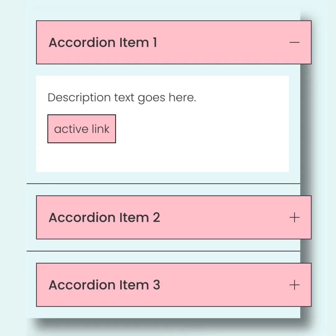
Your accordion background can be adjusted using the design menus in Squarespace, but if you want the title and the description to be different, this code is for you.
I also recommend playing around with the adding property, borders, and you can learn more about colors in this article.
/* Customize Accordion Colors */
.sqs-block-accordion .accordion-item__click-target {
background: yellow
}

.accordion-item__dropdown {
background: #e5f5f6
}
Lift the block with a custom shadow
If you host online events or have attendees across different regions, adding a visible time zone can save everyone a ton of confusion. This quick code appends your preferred time zone (PST, EST, GMT, etc.) right after the event time. Just update the letters between the quotation marks to match your needs.
/* Lift Accordion with a Shadow */
.sqs-block-accordion{
box-shadow: 15px 15px 15px rgba(0,0,0,0.5)
}
Change accordion description links into buttons (my fav accordion code!)
You can add a link to text inside an accordion description, but you’ll need this CSS to make that link look like a clickable button.
In this code, we use a border, background color, text color, and padding to make the button style. You can also use border-radius to change the shape.
Check out this article to learn more about creating custom buttons.
/* Change Accordion Links to Buttons */
.sqs-block-accordion a {
 border: 1px solid #000;
 background: pink;
 color: #333;
 padding: .5rem
}

.sqs-block-accordion a:hover {
 border: 1px solid #000;
 background: #848B79;
 color: #fff!important
}
And there you have it: three easy ways to customize your Squarespace accordion blocks with just a little CSS.
Remember, you can adjust the colors, padding, or styles in these codes to match your own brand design; it’s totally up to you. Copy, paste, and play around until you create the look that works best for your site.
As always, I’d love to hear how you use these codes! Drop a comment below if you have questions or if you customized one of the snippets in a fun way. And most importantly—have fun with your Squarespace website. 💛