How to customize your add on product style in Squarespace
Looking to give your product add-ons a visual upgrade? Squarespace has a great feature that lets you show related items right on your product page—but there’s not much you can customize in the editor. Luckily, with a few snippets of CSS, you can make them match your site's design perfectly.
In this tutorial, I’ll walk you through how to change the borders, button shape, background color, text styles, and more. Whether you want a sleek minimal look or something more bold and branded, I’ve got you covered.
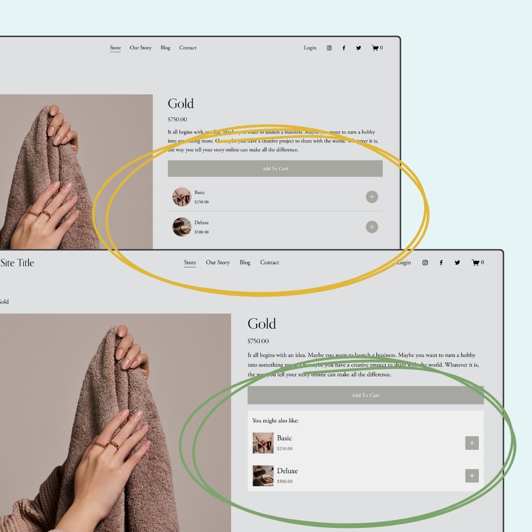
👇 Check out the live example below and grab the code snippets further down the post!
CSS Customizations for Product Add-Ons
1. Round the Add-On Image and Card Corners
This gives your add-on cards a softer, more modern look by rounding the corners of both the product image and the card container. You can adjust the 15px value to make it more or less rounded depending on your site’s style.
/* round thumbnail image */
.add-on-thumbnail{
  border-radius: 50% !important;
}
2. Make the Plus Button a Perfect Square
If your website uses square buttons instead of circles, this snippet removes the rounded border on the add-on’s plus button so it matches the rest of your design.
/* square the add on button */
.product-add-ons .sqs-add-to-cart-button {
  border-radius: 0 !important;
}
3. Replace the Border with a Simple Divider
This creates a simple divider line between each add-on instead of wrapping each one in a full box. It’s a great option for minimalist layouts.
/* simple add on border */
.product-add-ons .add-on-card{
  border:none!important;
  border-bottom:1px solid #a8a6a1!important
}
.product-add-ons .add-on-card:last-of-type{
  border:none!important;
}
4. Use a Background Color Instead of Borders
Want a soft background color to help your add-ons pop? This code removes the default border and adds a subtle background with padding. Feel free to swap out #efefef for any color code that matches your site.
/* add on block background */
.product-add-ons {
  background:#efefef
}
.product-add-ons .add-on-card{
  border:none!important;
}
5. Add a Custom Title Above the Add-Ons
This adds a little heading above your add-ons—perfect for guiding shoppers to check them out! You can change the wording, font size, or alignment as needed.
/* add on section title */
.product-add-ons:before{
  content:"You might also like:";
  padding-top:1rem;
  padding-left:15px
}
6. Style the Title and Price Text
Customize the font size of the product name and the color of the price to better match your brand’s typography.
/* add on item title  */
.product-add-ons .add-on-title{
 font-size:1.5rem!important
}
/*add on item price */
.product-add-ons .product-price{
  color:#333!important
}
7. Disable Clickable Images and Titles (Optional)
If you want customers to only click the plus sign to add an item (and not navigate away from the page), use this code to disable those links. Totally optional—just depends on the user experience you want to create!
/* remove link from add on item image and text */
.add-on-thumbnail-link, .add-on-details{
 pointer-events:none!important
}
Pro Tip: 📱 Don’t forget to double-check your design on mobile! Most of these styles will carry over perfectly, but it’s always smart to preview the layout on smaller screens.