How to Customize the Add to Cart Button in Squarespace
The “add to cart button” in Squarespace is designed to match your primary button style, but it doesn’t have to! 😉 In the video below, I’ll walk you through exactly how to customize this button across your site, using just a few lines of CSS. Whether it’s tweaking the background color, reshaping the button, or switching the text to say “Order Now,” you’ll see how simple it is to give your shop a polished, personal touch.
Watch the full tutorial below, then scroll down to grab the exact code snippets I used and see how each one works. You’ll find examples for product list pages, detail pages, and blocks, plus bonus tips for hover effects and button text changes.
📍 Quick Note Before You Start
There are three different types of Add to Cart buttons in Squarespace, and each has its own code name:
Product List (like a storefront view)
.product-list .sqs-add-to-cart-buttonProduct Detail Page (individual product)
.product-detail .sqs-add-to-cart-buttonProduct Block (content block)
.product-block .sqs-add-to-cart-button
You’ll want to target them separately if you want to give each one a unique look—or combine the selectors if you want the same style applied site-wide.
Let’s start with something simple: changing the button background color and text color.
This code is for the prodcut list or your storefront add to cart buttons:
.product-list .sqs-add-to-cart-button {
  background: red!important;
  color: #fff!important;
}
Next, let’s adjust the Shape of the Button
We can use border-radius to adjust the button’s shape. Border radius will curve the corners. A value like 50% will create an oval, 50px will create a pill shape, and the code below is a 10px value, so it will create slighly rounded corners for the add to cart button on an individual product page.
.product-detail .sqs-add-to-cart-button {
  border-radius: 10px;
}
Optional: Add a Custom Border
Borders can help your button pop against lighter backgrounds. You can match the border color to your font or add contrast—it’s totally up to you. Learn more about border codes here (opens in new tab)
.product-list .sqs-add-to-cart-button {
  border: 2px solid #333;
}
You can also adjust the button size and alignment
On the product list page, the button is designed to be the full width of the product column. We can use this code to make it smaller and scoot it to the center of the column for a unique look. Play around with these values until you have a look that works well with your own creative design!
.product-list .sqs-add-to-cart-button {
  padding: 10px;
  width: 50%;
  margin-left: 25%;
}
Now let’s make it interactive, and add a custom hover effect!
Adding a hover effect gives your site a more dynamic feel—and encourages clicks! Try this code to change the background color when someone hovers over the Add to Cart button. This will turn the button green on hover and switch the font color to white.
.product-list .sqs-add-to-cart-button:hover {
  background-color: #00a86b;
  color: #ffffff;
}
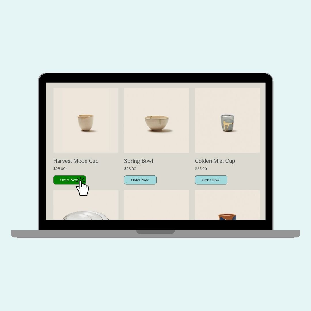
We an also change the button text, replacing “Add to Cart” with a custom message, like “Order Now”
If you want to switch it up and have your Add to Cart button say something else, like “Order Now” you can hide the original text and insert your own. This works by hiding the default label (with font-size: 0) and displaying your custom message using ::before.
Pro Tip: You can use this method on any of the selectors—just be sure to change .product-detail to .product-list or .product-block depending on where you want the new text to appear.
.product-detail .sqs-add-to-cart-button .sqs-add-to-cart-button-text {
  font-size: 0;
}

.product-detail .sqs-add-to-cart-button .sqs-add-to-cart-button-text::before {
  content: "Order Now";
  font-size: 16px;
  display: inline-block;
}
🧠 Quick Recap of the Selectors
Here’s a handy reference so you can target the right button on the right page:
Product List Page =
.product-list .sqs-add-to-cart-buttonProduct Detail Page =
.product-detail .sqs-add-to-cart-buttonProduct Block =
.product-block .sqs-add-to-cart-button
Last but not least - here is the full code used in the tutorial video! It combines quite a few of the techniques covered above to create a unique design:
/* Full add to cart button code with from insidethesquare.co */
/* product list button */
.product-list .sqs-add-to-cart-button {
  background:#a1d9dd!important;
  color:#333!important;
  border-radius:10px;
  border:1px solid #333!important;
  padding:10px!important;
  width:50%!important;
  margin-left:25%!important;
}
/* product list button - hover effect */
.product-list .sqs-add-to-cart-button:hover {
  background:green!important;
  opacity:1!important;
  color:#fff!important
}
/* product page button */
.product-detail .sqs-add-to-cart-button {
  background:blue!important
}
/* product block button */
.product-block .sqs-add-to-cart-button {
  background:yellow!important;
  color:#000!important;
}
/* hides original text */
.product-detail .add-to-cart-text {
  font-size: 0;
}
/* displays new text */
.product-detail .add-to-cart-text:before {
  content: "Order Now";
  font-size: 1rem
}