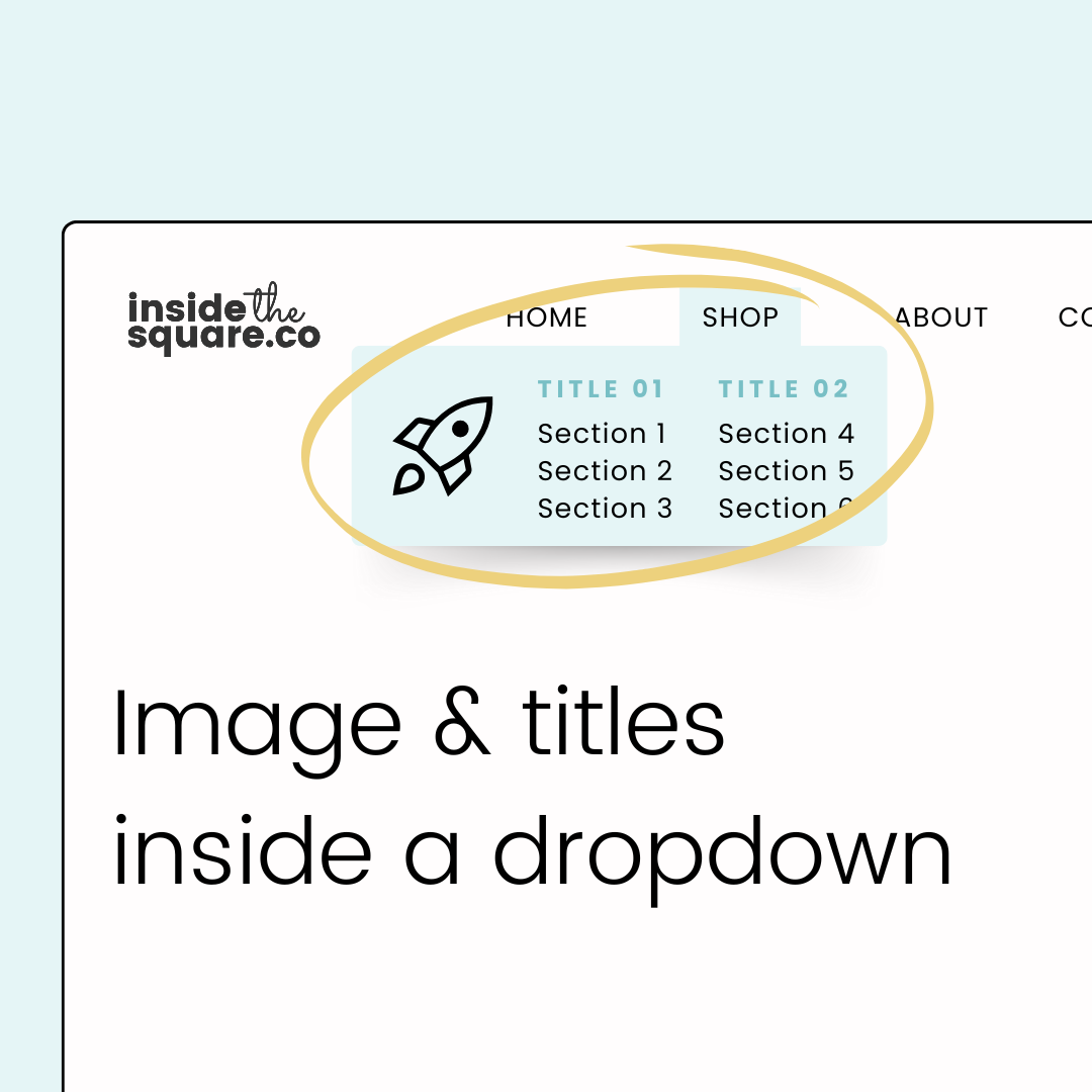
How to add images to your Squarespace dropdown
If you've ever looked at your Squarespace dropdown and wished it could do more, you're definitely reading the right blog post 😉 While the standard dropdown menu gets the job done, there's so much untapped potential waiting to be unleashed, and all it takes is a little creative code! In this advanced Squarespace tutorial, I'm sharing my favorite tricks to transform your drop down folder into a beautifully customized navigation tool that not only looks amazing but also enhances your visitors' experience.
We’ll be creating columns, adding titles, drop shadows, borders, and my favorite trick - an image!! Yup, you can use a few simple lines of code to add an image to your dropdown folder that wont interfere with your links. The codes and step by steps details are below the video overview.
Important update: Squarespace made changes to the program menu in May 2025. If your menu looks different than the video, press the / key to open the program search and search for Custom CSS to navigate there directly.
Starting with the Basics: Background and Shadows
First things first - let's make sure your dropdown menu stands out from the page! Sometimes the default dropdown can blend in a bit too much with your background, making it hard for visitors to see where the menu ends and the page begins. Here's where a little bit of custom styling comes in handy.
With just a few lines of code, you can:
Add a subtle shadow that lifts your menu off the page
Create a clean border to define the edges
Change the background color to complement your site's design
Pro tip: A light shadow can make a huge difference in how professional your dropdown looks, but remember to keep it subtle - we want to enhance the user experience, not distract from it!
.header-nav-folder-content {
box-shadow: 5px 5px 15px rgba(0,0,0,0.3);
border:1px solid #333;
background-color:#e5f5f6!important;
}
Creating Multiple Columns
Now here's where the magic happens - instead of having one long list of links, we can split them into neat, organized columns! This is perfect if you have more than a handful of links in your dropdown. The best part? You get to control exactly how those columns look:
Choose how many columns you want
Set the perfect amount of space between them
Adjust the width to fit your content perfectly
Pro tip: I’ve combined this column code with the box shadow, border, and background codes above.
.header-nav-folder-content {
box-shadow: 5px 5px 15px rgba(0,0,0,0.3);
border:1px solid #333;
background-color:#e5f5f6!important;
columns: 2;
column-gap: 30px;
}
Adding Section Headers
Want to take your dropdown organization to the next level? Adding section headers to your columns is a game-changer! These aren't just regular links - they're custom labels that help organize and guide your visitors through your menu options.
Here's what makes these headers special:
You can style them differently from your regular links
Add some extra spacing to make them stand out
Choose a different color to create hierarchy
Make them all caps for extra impact
Pro tip: Make sure you adjust the nth-type value for your link! This example is for two columns of three links, so the second title is above the 4th link. If you have 2 columns of 2, you’ll want to change the value 4 to 3, and if you have two columns of four, you’ll want to change that value to 5. Be sure to watch the video above to see it in action; that part starts around the 03:23 minute mark.
.header-nav-folder-content *:first-child a:before{
  content:"column one \A";
  white-space:pre;
  letter-spacing: 2px;
  text-transform: uppercase;
  font-size:.8rem;
  color:blue;
  line-height: 2rem!important
}
.header-nav-folder-content *:nth-child(4) a:before{
  content:"column two \A";
  white-space:pre;
  letter-spacing: 2px;
  text-transform: uppercase;
  font-size:.8rem;
  color:blue;
  line-height: 2rem!important;
}
Make It Pop with Custom Images
This is probably my favorite trick - adding custom images to your dropdown! Whether it's your brand icons, fun illustrations, or meaningful symbols, images can add that extra touch of personality to your navigation.
Here's what you need to know:
Upload your image through Squarespace's custom files
Position it exactly where you want it
Control the size to match your menu perfectly
Make sure it complements your content, not overwhelms it
Pro Tip: I’ve combined this column code with the box shadow, border, background, and column codes above. You’ll want to add column labels and customize the values to match your own unique site style.
.header-nav-folder-content {
columns: 2;
column-gap: 30px;
border:1px solid #333;
background-color:#e5f5f6!important;
box-shadow: 5px 5px 15px rgba(0,0,0,0.3);
background-image:url(image-url-here);
background-size:60px;
background-position: 10px ;
background-repeat:no-repeat;
padding-left:100px!important;
margin-left: -70px;
}
Managing Multiple Dropdowns
Got more than one dropdown in your navigation? No problem! Here's the secret to keeping everything organized: .header-nav-item:nth-of-type(#)
Change that # to match the dropdown link in your menu. If you dropdown is the second link, make the # 2. If it’s the 4th, update the # in that code to be 4. You’ll want to add this before every .header-nav-folder-content selector in your code. Check out the video above at the 09:37 minute mark to see this concept in action.
Important Notes and Pro Tips
Before you dive in, keep these helpful tips in mind:
Mobile Magic: All these cool customizations are for desktop only - your mobile menu will stay clean and touch-friendly (trust me, that's a good thing!)
Test, Test, Test: Always check how your dropdown looks at different screen sizes
Stay on Brand: Make sure your customizations match your overall site design
Keep It Simple: Just because you can add all these features doesn't mean every dropdown needs them all 😉

