How to Customize Squarespace Buttons: The Ultimate Guide for 2025
Whether you're working with primary buttons, secondary buttons, or that all-important header CTA, understanding how to customize your buttons can transform your website's user experience. In this tutorial video, I'm sharing everything you need to know about making your Squarespace buttons uniquely yours! You’ll also find additional details below, including custom CSS codes you can copy & paste to use on your own Squarespace site.
Understanding Button Types in Squarespace
One of the most common confusions I see is around different button types and how they behave. Let's break it down. In Squarespace, you'll work with three main button options - primary, secondary, and tertiary. While each can be customized independently, there's an important catch: your primary button style influences more than you might think!
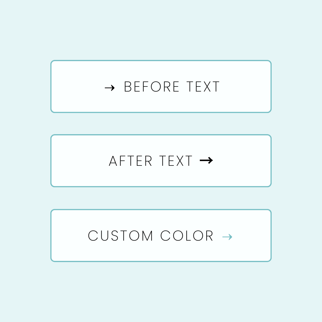
When it comes to how these buttons appear on your page, you'll encounter an important design choice: Fill vs. Fit. This setting makes a huge difference in how your buttons appear. With 'fill,' your button expands to take up the entire content block, giving you a bold, full-width statement. 'Fit' keeps it snug to your text, with options for alignment, perfect for more subtle or inline button placements.
The Hidden Impact of Your Primary Button Style
Here's something that might surprise you about your primary button style – it's actually pulling double duty across your entire website! When you customize your primary button, you're not just changing standalone button blocks. That same style flows through to your header navigation, making your call-to-action buttons pop. It shapes how your product blocks appear, giving your shop a cohesive feel. Even your form submit buttons and list sections inherit these styles, creating a unified look throughout your site.
Understanding this ripple effect is crucial for your website's design. Think of your primary button style as setting the tone for your site's interactive elements. When you're planning your button customization, consider how that style will look not just as a standalone button, but as part of your product gallery or at the bottom of your contact form. This interconnected design approach is what gives Squarespace websites their polished, professional feel.
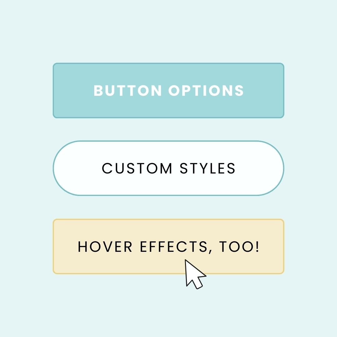
Making Your Buttons Unique: Customization Options
Your journey to perfect buttons starts in the site styles menu. Here you can adjust font families, sizes, and spacing to match your brand. Shape options range from classic rounded corners to modern pill shapes, with custom corner controls for precise adjustments. You can choose between solid fills that command attention or elegant outline styles, and fine-tune padding for the perfect visual balance. Remember to visit the color menu to select the perfect palette for your buttons – just make sure you're working within the right color theme for your section.
For those ready to take their buttons to the next level, custom CSS opens up exciting possibilities. You can create unique hover effects, add subtle shadows, and craft smooth transitions that make your buttons feel more dynamic and professional. Here's the custom CSS code I use to create a unique header button with a smooth hover effect:
/* Custom Header Button Style - Custom Code from InsideTheSquare.co */
header .sqs-button-element--primary {
    background-color: orange !important;
    border-radius: 80px !important;
    border: none !important;
    transition: all 1s !important;
}

/* Hover Effect - Custom Code from InsideTheSquare.co */
header .sqs-button-element--primary:hover {
    color: black !important;
    border-radius: 0px !important;
    box-shadow: 5px 5px 15px lightgray !important;
    transition: all 1s !important;
}
/* Style All Primary Buttons - Custom Code from InsideTheSquare.co */
.sqs-button-element--primary {
    background-color: orange !important;
    border-radius: 80px !important;
    border: none !important;
    transition: all 1s !important;
}

.sqs-button-element--primary:hover {
    color: black !important;
    border-radius: 0px !important;
    box-shadow: 5px 5px 15px lightgray !important;
    transition: all 1s !important;
}
Bringing It All Together
Remember, successful button customization is about finding the right balance. Start with your primary button style, ensuring it works well across all contexts – from standalone CTAs to product blocks. Then, use secondary and tertiary buttons to create visual hierarchy without competing with your primary style.
The best part? Once you understand these fundamentals, you can adapt and adjust your button styles as your website evolves. Whether you're launching a new product, starting a sale, or just refreshing your design, you now have the knowledge to make your buttons work perfectly for any situation. If you like the code part of this tutorial, I have some additional resources below that can help you customize your site even more!
Button Code Tutorials
