Using CSS Filters to Customize Squarespace
How Filter Codes Work
When you add a filter to content on your Squarespace site, it creates a layer that changes the way the content looks without actually changing the element. One of my favorite examples is the grayscale filter. We can use this to make images black and white, and then turn off the filter on a hover making them full color again.
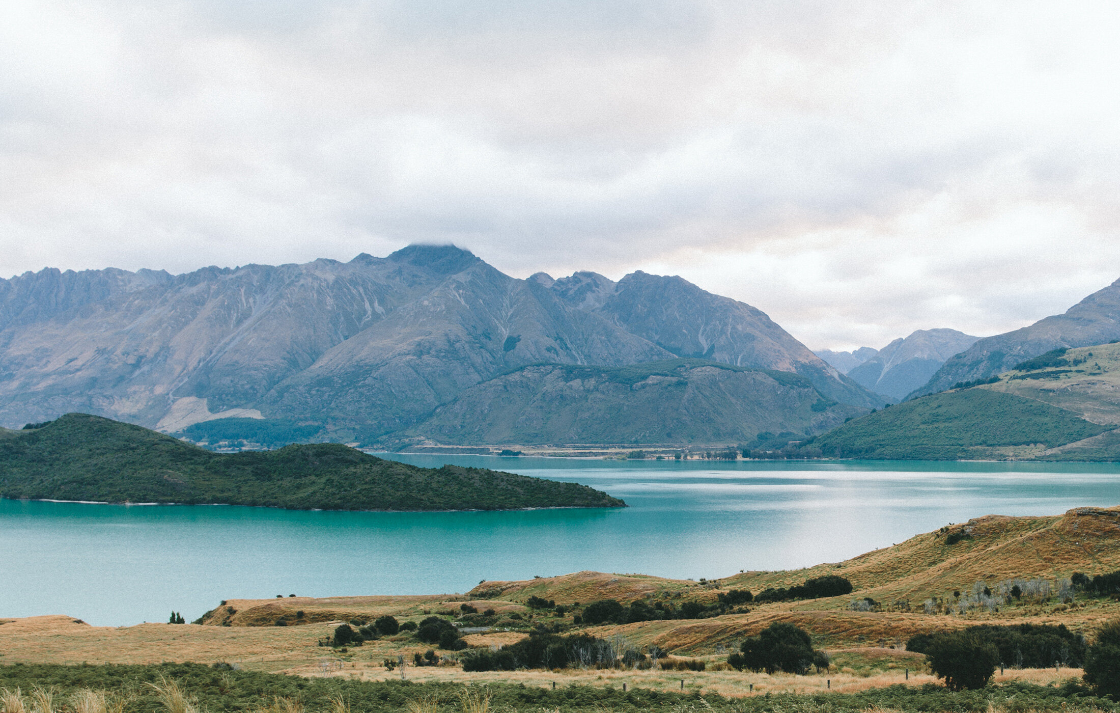
There are 6 main filter types available in basic CSS, and you’ll find a write up of all 6 below. Before you dig in, here is an example of a filter for an image block. Hover over the image below to see it in action, and be advised: hover effects don’t work on tablet or mobile, because there is no cursor to hover 😉
/* make the image gray */
#block-1234  {
filter: grayscale(1)
}
/* make the image full color on a hover */
#block-1234:hover {
filter: grayscale(0)
}

-
img {filter: grayscale(100%)}
This code will apply a grayscale filter to any image on your site. Adjust the level of the filter by changing the percentage between the parenthesis; 0% is no filter and 100% is full black and white.
-
img {filter: blur(5px)}
This code will apply a blur to any image on your site. Adjust the level of the blur by changing the number of pixels in the code; 0 is no blur and 100 is pretty darn fuzzy.
-
img {filter: brightness(20%)}
This code will brighten or darken an image on your site. Adjust the level of the filter by changing the percentage between the parenthesis; 0% is dark, 100% is normal, and anything above 100% will increase the brightness.
-
img {filter: contrast(150%)}
This code will change the contrast of an image on your site. Adjust the level of the filter by changing the percentage between the parenthesis; 0% is low contrast, 100% is normal, and anything over 100% will increase the contrast.
-
img {filter: hue-rotate(180deg)}
This code will rotate the hue of the colors in any image on your site. Adjust the hue rotation using degrees in the code below; 0deg is normal and 180deg is rotated to the opposite colors on the color wheel.
-
img {filter: invert(100%)}
This code will invert the colors of your image. Adjust the level of the filter by changing the percentage between the parenthesis; 0% is normal, 100% will completely invert the colors in your image.
Pro Tips for Custom Filters
Targeting matters → Filters can apply to more than just images, so consider combining selectors and IDs to make sure you are targeting exactly what you want to change.
Combine filters thoughtfully → You can stack multiple filters together, but keep it simple. Grayscale + slight brightness adjustment works great. Grayscale + blur + contrast + saturation all at once? That's overkill.
Mind your file quality → Filters can emphasize pixelation or compression artifacts in low-quality images. If you're planning to use blur or saturation, start with high-resolution photos.
Smooth transitions are key → If you're doing hover effects, always add a transition property so the change happens gradually. A transition of 0.3s to 0.5s feels smooth without being sluggish.
Consider accessibility → Some filters (especially brightness and contrast adjustments) can make text harder to read. If you're filtering an image with text overlay, double-check that everything stays legible.
Grayscale isn't just black and white → Try pairing grayscale with a slight saturation boost on hover (like 120%) to make colors pop even more when revealed. The contrast between muted and vibrant feels extra satisfying.
Save the originals → Before applying permanent filters in your image editor, try the CSS version first. Code-based filters are reversible and adjustable, while image file edits aren't.
Combining filters with opacity & gradients
This code is an advanced one created by Custom Codey, and it’s way too much fun to keep to myself! For this gallery example, we are combining filters, gradients, and opacity to create a truly unique image experience.
Hover over the images below to see the full effect and keep in mind that hover effects will not work on a tablet or mobile device because there is no cursor to hover with.
.gallery-grid-item {
  background: linear-gradient(to bottom, pink, #a1d9dd);
}

.gallery-grid-item img {
  filter: grayscale(50%);
  opacity: 0.2;
  display: block;
  transtion: all 1s
}
.gallery-grid-item img:hover{
opacity:.8!important;
filter:grayscale(0)!important;
}