Flodesk Analytics Explained: Metrics You Should Track
Analytics are your email’s way of talking back to you. They tell you what’s working, what’s not, and where your audience is most engaged. Once you know what to look for, those numbers stop being scary and start feeling like clues; little insights that help you build stronger connections with your subscribers.
In this guide, we’re going to keep things simple. You’ll learn which metrics actually matter (and which you can ignore for now). We’ll be looking at three main categories: your overall account, your forms, and your emails themselves.
The whole reason I wrote this article is to help you understand exactly what to track, and more importantly, why it matters, so you can make better decisions, grow your list, and send emails your audience actually looks forward to opening.
Key Terms You’ll See in Flodesk & What They Actually Mean
Before we start tossing around marketing lingo, let’s pause for a quick vocab check. And no, you don’t have to memorize these. Once you start checking your analytics regularly, you’ll naturally get familiar with what each number means. The goal here isn’t to become a data scientist; it’s to know enough to make smarter decisions and connect with your audience in a more meaningful way.
📊 Analytics
Analytics are the measurements that show how your emails are performing. Think of them like your report card — they show what’s working well and what might need a little extra attention.
🧾 Metric
A metric is one specific piece of data you can track — like how many people opened your email or clicked a link. Each metric gives you one clue about your audience’s behavior.
🧍 Segment
A segment is a group of subscribers who share something in common. For example: everyone who downloaded your freebie, or all of your paying clients. Segments let you send more targeted, personal emails instead of one-size-fits-all messages.
🪄 Form
A form is how people sign up to get your emails. It might be a pop-up, a box on your website, or a full-page opt-in. Each one is a little “doorway” into your list.
🔁 Workflow
A workflow is a series of automated emails that go out based on triggers — like “someone just joined my list” or “someone clicked this link.” It’s how you can stay connected without manually sending every email.
💥 Conversion
When someone takes the action you want — like signing up, clicking a button, or making a purchase — that’s a conversion. Basically, it’s your email doing its job.
📈 Open/click/unsubscribe rate
These are the “big three” engagement metrics: Open rate (how many people opened your email), click rate (how many clicked a link inside it) and unsubscribe rate (how many decided they’ve had enough for now)
Top 3 General Account Metrics to Watch
Let’s start at the 30,000 foot view. Your account-level analytics show you the overall health of your email marketing, kind of like the dashboard of your car. You don’t need to obsess over every little number, but it’s good to know how things are running. These metrics help you spot if your list is growing, if people are engaging with what you send, and whether your timing and topics are landing well.
-
Each new subscriber means your reach is expanding, and that’s worth celebrating! In Flodesk, you’ll see how many new people signed up through your forms or integrations.
If your subscriber count isn’t budging, it might be time to refresh your opt-in forms, promote your lead magnet again, or add your sign-up link to new spots (like your Instagram bio or blog posts). Growth doesn’t have to be huge every week, but it should be steadily increasing.
Pro tip: Focus on attracting quality subscribers who actually want to hear from you, not just boosting your total number. A small, interested audience will outperform a big, disengaged one every single time.
-
Your open rate tells you how many subscribers are curious enough to open what you send, and whether your subject lines and tone are really connecting.
High open rate means your content is clicking with people; low open rate just means it’s time to experiment a little.
Try shorter subject lines, start with a question, or test out an eye catching emoji. Don’t forget your preview text too - that little sentence can pop up in some inboxes and inspire a click even if your subject line misses the mark.
Everyone always wants to know -what’s a “good” open rate? ! - and the truth is, there’s no magic number. It totally depends on your industry, audience size, and the type of content you send.
When I started, I averaged around 20%, and now I hover around 40–45% on my regular weekly emails (a little lower during promo weeks, which is totally normal).
Pro tip: Track your open rate for regular emails and your sales emails separately. It helps you see how your audience reacts to different types of messages and gives you a clearer sense of what’s performing best over time.
-
Unsubscribes aren’t bad. In fact, they’re a sign of a healthy email list.
Every time someone opts out, your list gets a little cleaner, leaving only the people who actually want to hear from you.You can track this in your Flodesk analytics under each email and at the account level. If you see a small, consistent trickle of unsubscribes, that’s totally normal.
A sudden spike? That’s your cue to review what you sent, maybe it wasn’t relevant to everyone, or your sending frequency changed. Check out the email metrics section of this article for some performance pointers.
Key takeaway: If you only tracked these three metrics (subscribes, open rate, and unsubscribes) you’ll have a clear picture of your over email list health. Grow steadily, keep your readers engaged, and don’t fear the unsubscribes. They’re just part of keeping your list vibrant and focused.
Top 3 Flodesk Form Analytics to Watch
Your forms are the doors to your email list. Every subscriber walks in through one — whether it’s a pop-up, inline, or full-page opt-in. Tracking your form analytics helps you figure out which doors are wide open and which might be sticking a little.
-
This number tells you how many people have seen your form; not everyone who visited your site, but everyone who scrolled far enough to see the sign-up.
If you’re getting low traffic here, your problem isn’t the form; it’s visibility. Try moving it higher on the page, embedding it in a blog post, or adding a pop-up.
Pro tip: Think of visitors as awareness. If not enough people are seeing your form, no amount of tweaking the copy will fix that. Increase eyeballs first, then optimize.
-
This is your “heck yes” count; the number of people who saw your form and thought, I want in.
If the number is small compared to your visitors, your form might not be compelling enough. Try changing the headline, simplifying the fields, or adding a quick benefit (“Get instant access,” “Delivered straight to your inbox”).
-
This is the percentage of people who saw your form and actually signed up. Flodesk calculates this for you:
Opt-ins ÷ Visitors × 100 = Conversion Rate.A healthy conversion rate for most small creators is around 20–40%, depending on your offer and audience.
Pro tip: Focus on improving your conversion rate after you have consistent traffic. You can’t optimize what isn’t being seen.
Key takeaway: Your form analytics are your early warning system. Visitors show if people are finding you, opt-ins show if they care, and your conversion rate shows if your message is working.
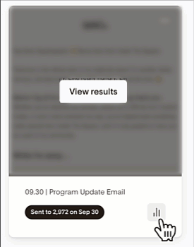
Top 3 Flodesk Email Analytics to Watch
Once you hit send, it’s normal to wonder “did anyone actually read that?” and Flodesk’s email analytics give you clear answers. They show how many people opened, clicked, and unsubscribed from each message so you can see what’s working and where you can improve.
You don’t need to obsess over every percentage point; these numbers are simply feedback from your audience. They help you understand what’s connecting, what’s converting, and how your list is evolving over time. The more you send and review, the easier it becomes to spot patterns, experiment confidently, and make data-based decisions without getting lost in the details.
-
Your open rate tells you how many subscribers were curious enough to click that subject line. It’s the first sign of whether your email stood out in their inbox. If this number feels low, don’t panic — it’s usually a quick fix. Test new subject lines, add a dash of personality, or keep things short and curiosity-driven.
Pro tip: Compare your open rate to your own past sends, not someone else’s. Consistency is more important than perfection — if your audience knows you deliver value, opens will rise over time.
-
Your click rate shows what percentage of people not only opened your email, but actually did something — clicked a link, a button, or an image. This is the best measure of whether your message inspired action. If your open rate is solid but clicks are low, your content might not clearly guide readers toward what you want them to do.
Pro tip: Keep your emails focused. One clear call-to-action almost always performs better than three competing ones.
-
Unsubscribes can sting a little, but they’re not bad, they’re part of a healthy list. Each one helps refine your audience so you’re sending emails to people who actually want to hear from you. A small, steady number is totally normal; a sudden spike is your cue to review what changed.
Pro tip: Don’t take unsubscribes personally! They keep your list engaged, your deliverability strong, and your analytics more accurate.
Key takeaway: Every send is a learning opportunity. Opens show who’s paying attention, clicks show who’s taking action, and unsubscribes show who’s no longer the right fit — and that’s all valuable data.
Let’s wrap this up:
The truth is, you don’t need fancy dashboards or complicated formulas to understand how your Flodesk emails are performing. You just need to keep an eye on the right few numbers.
Start with your account overview: are people joining, opening, and staying subscribed?
Then check your forms: are visitors actually signing up and converting?
Finally, look at your emails: are your subject lines catching attention, your links getting clicks, and your audience staying engaged?
That’s it. Those simple numbers tell you everything you need to know about what’s working and what’s not.
Over time, you’ll start to see trends. You’ll know which forms bring in the best subscribers, which types of emails people love, and when it’s time to refresh your approach. That’s when the real magic happens; when your analytics stop feeling like data and start feeling like direction.
So don’t overthink it. Check your numbers, make small tweaks, and keep showing up in your subscribers’ inboxes with value, clarity, and confidence.
Pro tip: The best analytics habit? A quick 10-minute check-in each week. No spreadsheets, no stress — just awareness.
I love pairing my Squarespace website with Flodesk for sending emails, automating workflows, and selling digital products.
Start your free trial and get a discount on your first year when you use my affiliate link below.